
Home
About us
Services
Insight
Pricing
Contact
English
Responsive Design
RISE PARTNERS
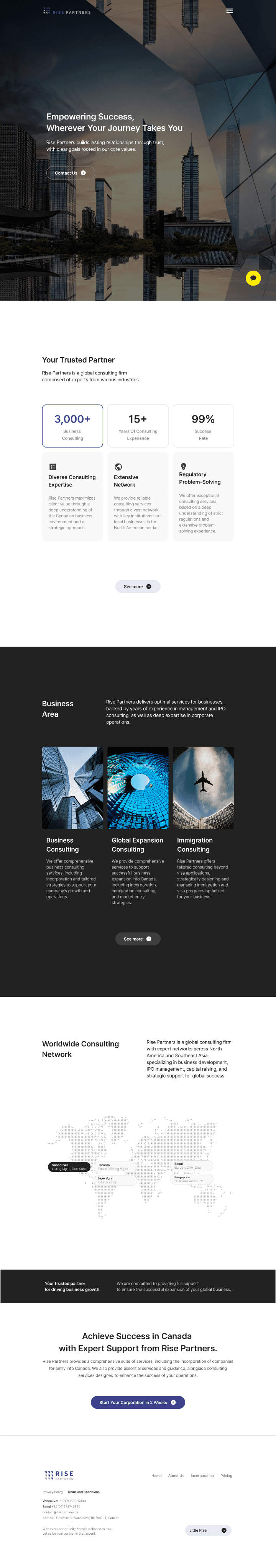
Responsive website redesign for a business consulting firm
PROJECT OVERVIEW
Redesigned the Rise Partners corporate website to improve service clarity and usability.
Focused on simplifying complex information and restructuring content to better communicate the company’s services and business value.
Project Type
Responsive Redesign
Industry
Business Consulting
Timeline
10 Weeks
My Role
UX Research
UX/UI Design
Design System
Usability Testing
!
Core Problem
The existing website lacked a clear information structure and failed to effectively communicate services. This caused user confusion and made it difficult to understand offerings or take action.
User Insights
We analyzed user feedback and consultation data to identify recurring usability issues and pain points.
These insights helped define the core problems and guided the design direction.

Person A
(36, Female)
“There was a lot of text, but the wording was difficult, and I still couldn’t clearly understand what the company actually offers. It was frustrating.”
“The pricing is clearly listed, but I couldn’t tell exactly what’s included in each plan. It was difficult to compare.”

Person B
(42, Female)
“The content felt cluttered, and the buttons looked different on every page, so it was hard to focus and I kept getting confused about where to click.”
“On mobile, the text was small and the menu didn’t respond well — I ended up switching to my laptop.”

Person C
(48, Male)
“There was no consultation form, so I had to contact them by phone or email. It felt inconvenient.”
“After clicking, I didn’t know what was happening or what to do next. There was no clear guidance.”
THE PROCESS
1
Design Approach
Focused on improving clarity and usability by restructuring content hierarchy and simplifying navigation.
Prioritized key services and user flows to help users quickly understand offerings and take action.
2
Design Solutions
Restructured the sitemap and refined key page content to improve clarity.
Introduced a clearer service structure with visual process flows and supporting content to guide user understanding. Simplified the consultation flow and CTA to make it easier for users to get started.
3
UI System
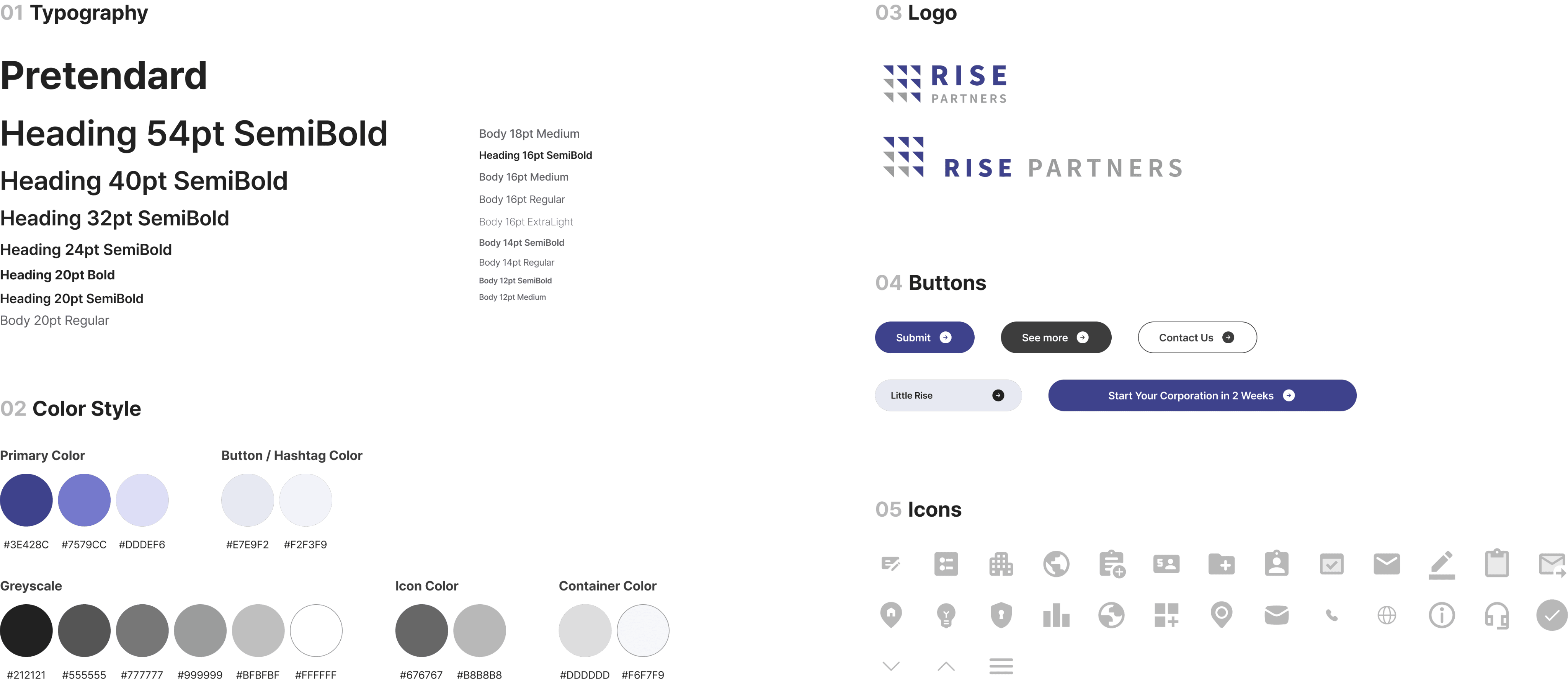
Built a consistent grid-based design system and applied responsive components. Visual elements like icons, service tags, consultation buttons, and layout highlights helped guide user flow and reinforce brand consistency.
4
Impact & Insights
After launch, consultation inquiries significantly increased, and both user understanding and trust improved. Collaborating with various teams helped develop cross-functional communication and problem-solving skills, and demonstrated how design can drive real business outcomes.
Problems & Solutions
Previous Problems
Lack of Clarity in Service Offering
Inconsistent Layouts & UI Confusion
Poor Mobile Usability
No Clear Way to Start Consultation
Improved Solutions
Clearer Content & Service Messaging
Consistent & Intuitive UI Design
Responsive Mobile Optimization
Streamlined Consultation Flow
How we Solved the Problem
risepartners.ca/
FEATURED PAGE
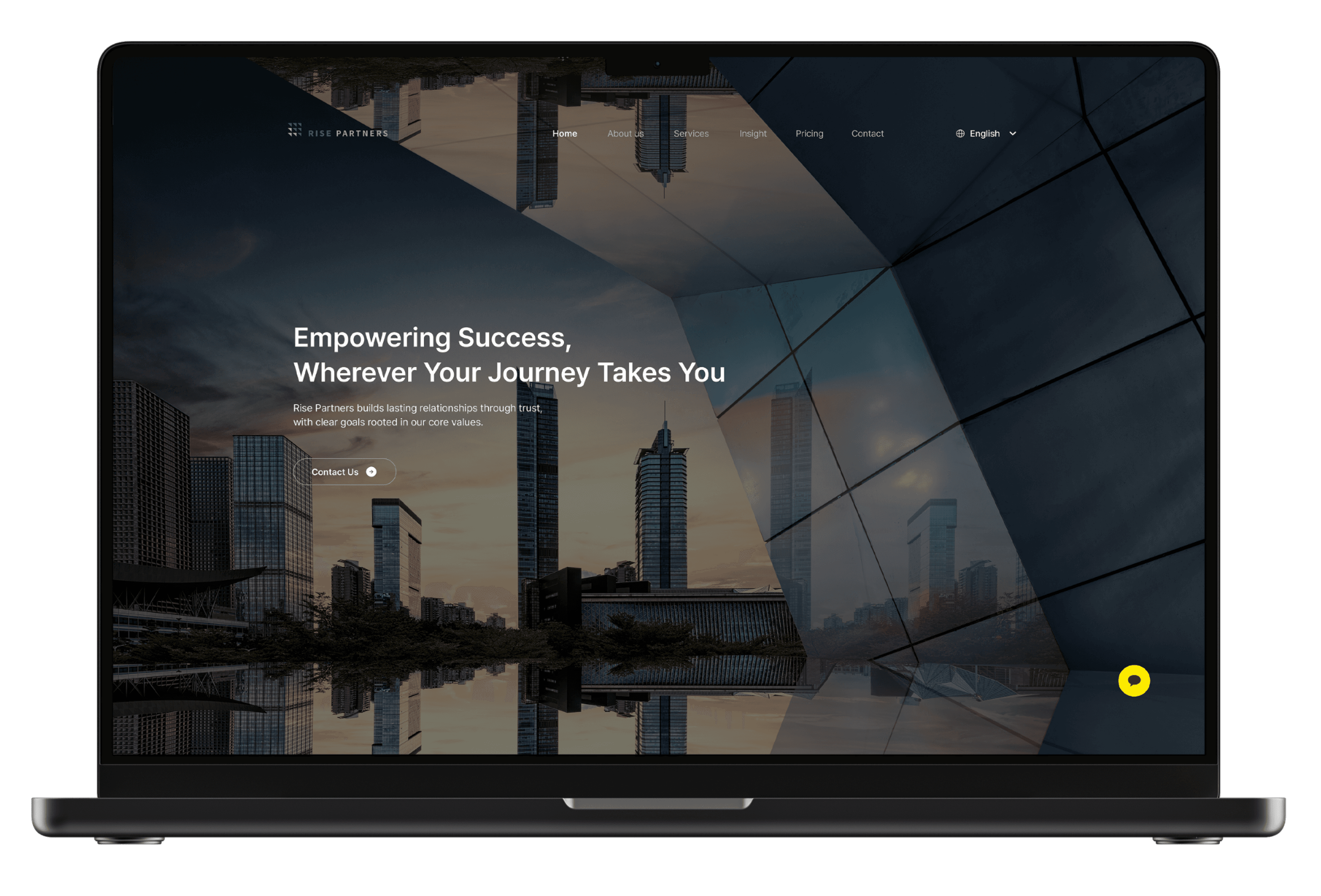
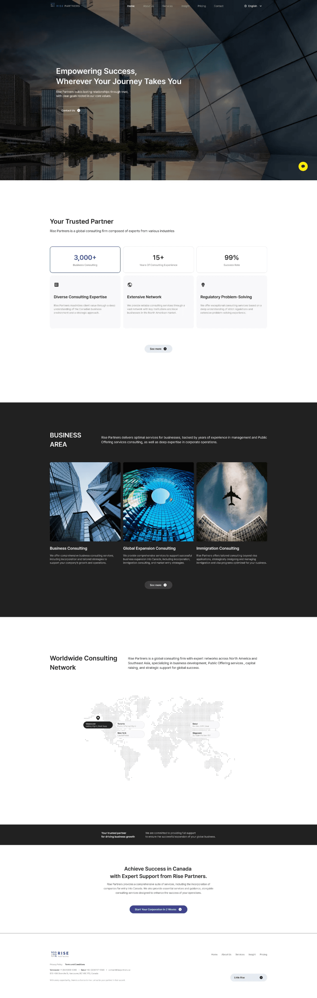
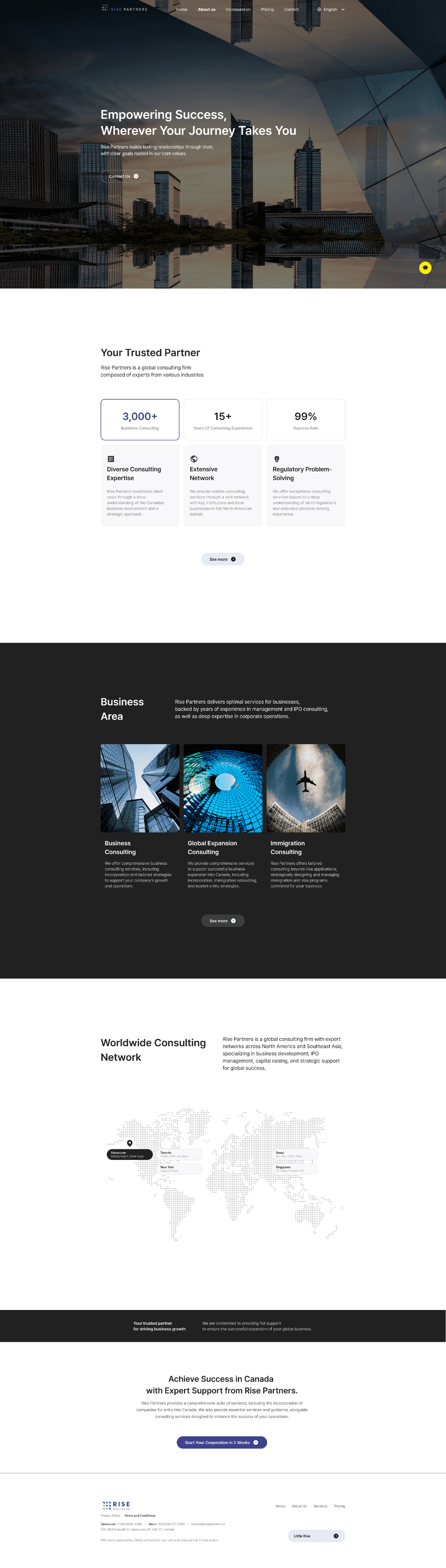
Home
Simplified the homepage to clearly communicate the company’s value proposition and key services at a glance.
Structured content to guide users toward core actions and improve overall clarity.
Real-time consultation chatbot
Hero section with company credentials
Clear introduction to core services
Consultation CTA section
Fully responsive design for mobile and desktop
About Us
Structured content to improve readability and provide a clear understanding of the company’s identity and expertise.
Service
Organized services into a clear and scannable layout to help users quickly understand offerings and make informed decisions.
This helped users quickly understand and compare services.
Icons and hashtags used to clearly present each service
Visual process flow that illustrates service steps and timeline
FAQ section to reduce repetitive questions
Contact button to encourage quick consultation inquiries
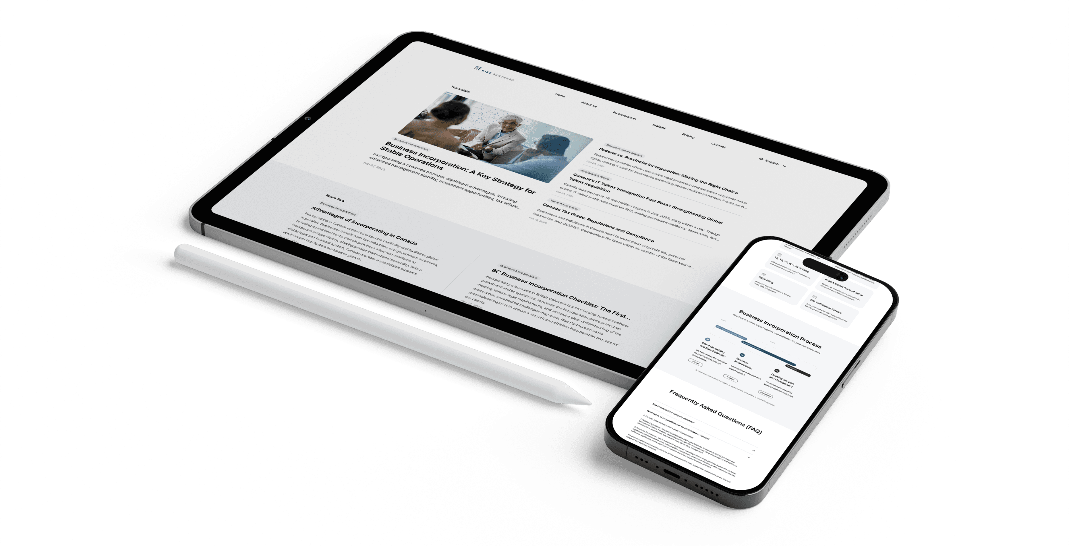
Insight
Designed content blocks to enhance readability and encourage user engagement.
This helped users better understand the content and stay engaged longer.
Thought-leadership content that builds credibility
Helpful content to support user understanding of services
SEO-friendly structure to increase organic visibility
Engaging topics that encourage users to stay and explore more
Pricing
Simplified pricing structure to make plans easier to compare and reduce decision-making friction.
This reduced decision-making friction and improved conversion.
Visually structured comparison of service plans
Icons and highlights for quick scanning
Tooltips and footnotes to provide additional clarification
Call-to-action button leading to consultation flow
Contact
Streamlined the contact flow to reduce friction and make it easier for users to initiate inquiries.


Grid System

Desktop: 1920px
Columns: 12 Margin: 302 Gutter: 16
302px
16px
1316px
1920px
302px

Laptop: 1728px
Columns: 8 Margin: 390 Gutter: 12
1728px
948px
390px
12px
390px

Tablet: 1024px
Columns: 6 Margin: 156 Gutter: 12
1024px
712px
156px
12px
156px

Mobile: 416px
Columns: 2 Margin: 16 Gutter: 12
16px
16px
384px
12px
416px

Mobile: 390px
Columns: 2 Margin: 49 Gutter: 12
49px
49px
12px
390px
292px
Style Guide
IMPACT & INSIGHTS
Redesigning the website wasn’t just about visuals — it was about achieving clarity,
improving accessibility, and driving real business results .
Improved Trust
Clearer structure and consistent UI increased user confidence in the brand and services.
Increase in Consultation Inquiries
Clearer structure and consistent UI increased user confidence in the brand and services.
Higher User Engagement
Improved content structure helped users stay longer and explore more pages.
User Feedback
“It was much easier to understand what services are offered
at a glance. It felt professional and trustworthy.”
- Emily P
“I liked how I could find the info I needed and connect to
consultation right away.”
- David L
What I Learned
Learned how to simplify complex business information into clear and intuitive user experiences.
Strengthened the ability to align design decisions with both user needs and business goals, balancing usability and visual clarity.